Build a Dashboard in Tanium
This example shows how to create a dashboard to follow patching. For this, we use the Patch List Compliance sensor.
Create the Dataset
Measure patch compliance for one rollout ring. The dataset should answer one question: what is the compliance status of the endpoints in Ring1 for this patch list?
- Use a small scope such as Ring1, not a large production group.
- Keep one endpoint field in the dataset, such as Computer Name, so you can go back from the chart to the report.
- Only add sensors you need. Extra columns make the dataset harder to read and maintain.
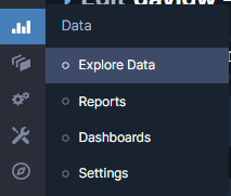
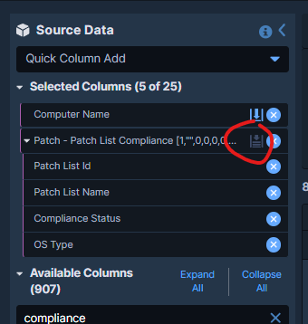
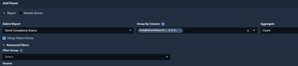
- In Reporting, open Explore Data.
- Add the Computer Name sensor.
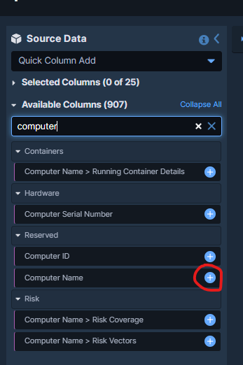
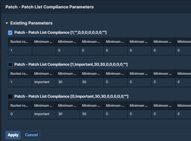
- Add the sensor Patch – Patch List Compliance.
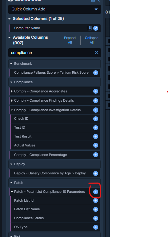
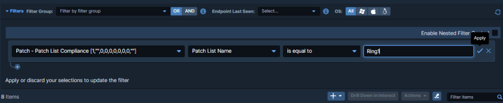
- Select the patch list compliance rows you want to analyze. Here the report is filtered to the target patch list used for Ring1.
- Click Add Filter and restrict the dataset to Patch List Compliance -> Patch List Name -> Equals -> Ring1.
- From Actions, choose Flatten by Patch so each patch result is represented as its own row.
Why flatten the data? Patch compliance data is often grouped. Flatten by Patch puts each patch on its own row. This makes the chart easier to read and count. Without it, the dashboard can hide useful detail.
Choose the Right Visualization
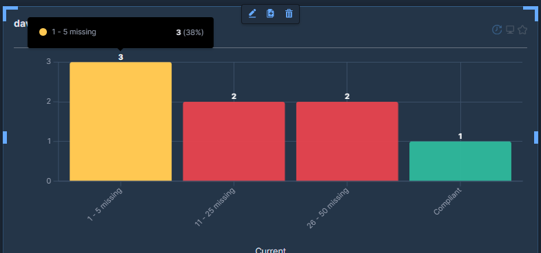
The goal is not to list every patch. The goal is to see the compliance split quickly. A status chart is better than a raw table for that first view.
- With the report open, click Add Visualization.
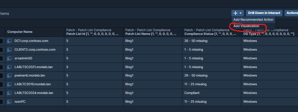
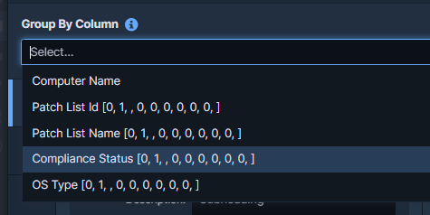
- Select Compliance Status.
- Name the chart clearly, for example Compliance by Status, then save the visualization.
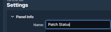
Use clear names. Titles such as Ring1 – Patch Compliance are easier to understand later than Status or Chart 1.
Build the Dashboard
- Open Dashboards and create a new dashboard, or edit an existing operational dashboard.
- Click Add Chart Panel, select the report created earlier, then choose the Compliance Status visualization.
The dashboard is now the first view. The report stays the place for drill-down and troubleshooting.
Operational Design Tips
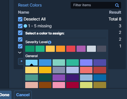
- Align colors with the operational meaning of the result. A dashboard should be readable in a few seconds.
- Use one panel per decision axis. Do not mix ring health, exception lists, and detailed inventory in the same first screen.
- Prefer multiple small focused charts over one large overloaded panel.
- Keep the dashboard tied to a stable filter. If the patch list or ring name changes often, maintenance becomes the real problem.
- Give the panel a meaningful name, then click Done.

- Click Save Dashboard.
Sensor and Data Model Limits
The dashboard is only as good as the sensor output. If the patch list is too broad, old, or not aligned with the rollout group, the chart may look clean but still be wrong.
- Check what the sensor really returns before you use it as a KPI.
- Test the filter on a few known endpoints before sharing the dashboard.
- If the audience is not technical, keep the chart high level and keep the detailed report for engineering work.
Patch List Compliance Sensor
Good Use Cases
- Patch rollout follow-up by ring or pilot group.
- Operational status dashboards for a service owner who needs a quick summary before opening the detailed report.
- Shared dashboards where the audience needs visibility but not full reporting access or full query depth.
If the dataset is good and the chart matches the question, the dashboard stays useful. If the dataset is weak, the chart only hides the problem.